‘COLOUR’ – a very powerful indicator that can be related to peoples’ emotions! In personal life, colours take a major role say – during spiritual celebrations, people prefer yellow, while white has connections with birth and death. Similarly, in business colours play an important part according to psychology. Let’s see how colours, user experience and conversions related with each other.
Colours, User Experience (UX) and Conversions
It is mandatory for every business to use perfect color combinations in its website, brand marketing campaigns and even on click through buttons (CTAs) to have a better user experience. Since colours are associated with emotions and each colour has got its varied impact, designers and marketing gurus take key in-charge in deciding the right colours. If you want to experience positive user engagement, brand identity and recognition, then start listening to colours. You will be amazed to see how it reflects in increasing your audience ratio.
Colours and its Reflections for Users
Blue – Peace, Trust, Loyalty
Green – Nature, Growth, Positivity
Red – Power, Passion, Aggressive
Orange – Cheerful, Friendly, Confidence
Pink – Youth, Fun, Romance
Yellow – Energy, Creative, Positivity
Black – Royal, Classy, Formal
White – Purity, Clean, Simplicity
Brown – Strong, Seriousness, Reliable
Grey – Neutral, Balanced, Conservative
Purple – Creativity, Wisdom, Feminine
However, these colours and its impacts might vary between cultures, lighter/darker shades and industries. For example, a darker version of pink evokes fun and youth mood while a lighter shade of pink can be associated with romance. While taking the age criteria, youths prefer bolder shades whereas the middle-aged people go far mild tones. In short, use colours to guide your users to travel across your website and its important components, make them connected with your website without any distraction.
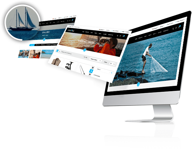
Let’s make it very simple. For example, if you are about to design a website related to ‘Fishing’, say that sells fishing equipments. Think what comes to your mind? Fishing! Water! Sea! Blue!! Yeah, you got it right. You can use ‘Blue’ as your primary colour while designing your website, a very common colour that reflects peace, trust, safe, loyal, refreshing and much more. Refer a fishing theme developed by us to get some idea. Keep it simple but logical. Though we have a common colour theory, as said earlier, it varies according to industries.
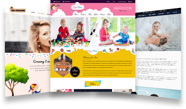
Colours into Conversions can be possible only when you use the right colours for the right audience. Industry study and audience research is a MUST. For example, when you are about to design a website for ‘Kids’, that sells toys make use of bright colours like ‘Yellow’, ‘Red’ and ‘Orange’ which are attractive, highlights your products and engages the users with your website.
Colours and CTAs
Taking care of your CALL to Action (CTAs) buttons is important as they can boost up your conversion rates. However know that, there is no secret colour that can help you with conversions. It is all about how well the colour is reflecting your brand, audience and the industry. For an instance, most of the CTA buttons for ‘Download’, ‘Subscribe’ and ‘Click Here’ will be in ‘Green’ it does not mean that green colour CTAs will convert. A red CTA button might also have higher conversion rates when it perfectly matches with the concept. For example, for a restaurant website if you want to order food online, a red CTA button with a fiery caption can work. Maintain your consistency and professional touch all through the website along with assuring the colour psychology being followed.
To conclude, Listen to your audience, learn from the user experiences, get to know where top 5 clicks fall on your website. Need more clarity on this important, interesting topic? Write us a line; we will get back to you.